
Where to find it: Reporting → Sales
Alright, this is the one everyone wants to see. The Sales report is the most chart-packed page in your control panel, and for good reason — it tells the complete financial story of your store. Revenue trends, order patterns, customer behaviour, payment preferences, geographic reach, and your biggest milestones over time. It’s all here.

AI Sales Analysis
At the top, the AI Sales Analysis gives you a performance rating — like “GOOD” or “GREAT” — along with a written summary of how your sales are trending. It might tell you that your revenue is up from last month with a stronger average order value, flag that your data shows a seasonal peak coming up, or suggest the best time to plan your next promotion. Hit “View full analysis” for the complete breakdown.
Time Period Tabs
Across the top, tabs let you switch between Yesterday, 7 days, 30 days, This month, Last month, and This year. Everything on the page updates to reflect your chosen window, so you can zoom in on yesterday’s performance or step back to see the annual picture.
Headline Stat Cards
Four cards give you the instant snapshot:
- Revenue — Your total sales value for the selected period, with a sparkline trend.
- Orders — Your total order count, with its own sparkline.
- Avg Order Value — How much each customer spends per order on average. This is one of the most important metrics in ecommerce — small increases here can have a big impact on your bottom line.
- Top Product — Your bestselling product for the period, shown with its image and unit count. Always good to know what’s flying off the shelves.
Average Order Value Over Time
A line graph tracking your AOV day by day over the selected period. This reveals whether customers are spending more or less per order over time. Look for patterns — does AOV spike when you run promotions? Does it dip on certain days? Understanding this trend helps you fine-tune your pricing, bundles, and upsell strategies.
Orders Over Time
A combined bar-and-line chart showing both your revenue (bars) and order count (line) over time. This is important because it helps you understand whether revenue growth is coming from more orders or bigger orders. If the bars are growing but the line is flat, your AOV is increasing. If both are climbing, you’re winning on all fronts.
Orders by Traffic Source
A pie chart breaking down where your paying customers originally came from: direct visits, Google organic, social media, referrals, and more. This is different from the Traffic report because it only counts visits that actually resulted in a sale. A channel might send lots of visitors but few buyers — this chart shows you which channels convert.
Payment Methods
A pie chart showing how your customers prefer to pay — card payments, PayPal, digital wallets, offline payments, and so on. If one method dominates, you know where to focus your checkout experience. If you only offer one payment method and it’s not the one your customers would prefer, this chart will make that painfully clear.
Your Best Periods
Four cards showing your best ever day, week, month, and year by revenue and order count. These are your store’s all-time records — the peaks you’re trying to beat. They’re great for spotting seasonal trends (if your best month is always December, you know when to prepare) and for setting goals.
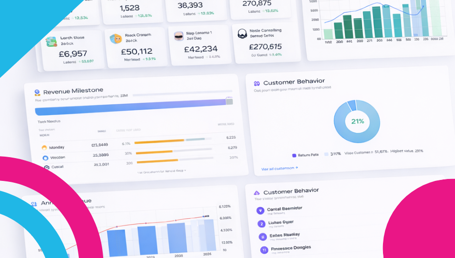
Revenue Milestones
A progress bar tracking your total lifetime revenue towards the next milestone. It shows how far you’ve come and how close you are to the next target. This is one of those features that’s both motivational and practical — when you can see you’re 80% of the way to a milestone, it gives you that extra push to keep going.
Busiest Days
A horizontal bar chart showing which days of the week get the most orders. Is Friday your golden day? Does Monday slump? Does the weekend outperform the weekdays? This chart answers those questions instantly, and it should directly inform when you schedule your promotions, social posts, and email campaigns.
Busiest Months
A bar-and-line chart showing total orders and revenue by month across the year. This is your seasonal pattern laid bare. You’ll see your peak trading months, your quiet periods, and everything in between. Use this to plan your year — stock up before your busy months, run promotions during quiet ones, and set realistic targets based on what actually happens in your store.
Customer Locations
A world map showing where your orders are shipping to, with a slider to adjust the time window. Bright dots mark order locations, and you can zoom and pan to explore. This is the geographic view of your customer base — instantly see whether you’re a local business, a national one, or reaching international markets.
Sales Summary
A month-by-month table showing your revenue, order count, and average order value for each recent month, with a total row at the bottom. This is the cleanest way to compare your performance month over month without any visual noise — just the numbers, side by side. There’s also an “Export Orders” link to download your data if you need it for accounting or deeper analysis.
Customer Behaviour
A donut chart splitting your customers into one-time buyers versus repeat customers, shown as a percentage. This tells you how loyal your customer base is. If the vast majority are one-time buyers, there’s a huge opportunity to bring them back — follow-up emails, loyalty rewards, or discount codes for their next order can shift this balance significantly.
Top Customers
A ranked list of your highest-spending customers by total lifetime value, showing their name, order count, and total spend. These are your VIPs — the people who keep coming back and spending the most. They deserve your attention: a personal thank-you, an exclusive offer, or early access to new products goes a long way with your best customers.
Annual Revenue
A multi-year bar chart at the bottom of the page showing your revenue and order count trends year over year. This is the ultimate big-picture view. You can see how your business has grown (or changed) over its entire history. It’s incredibly satisfying to see those bars getting taller year on year.
Why It Matters
Traffic tells you who’s visiting. Sales tells you who’s actually buying — and that’s the number that pays the bills. With this many data points, you can understand not just how much you’re selling, but when, to whom, from where, and through which channels. The gap between traffic and sales is your conversion story, and it’s one of the most important things to understand about your store.
What to Do With It
Use Customer Locations to inform your shipping strategy. If customers are ordering from regions where your delivery is slow or expensive, that’s a friction point worth addressing.
Track your average order value obsessively. Small increases in AOV can transform your revenue. Think about product bundles, free shipping thresholds, “customers also bought” suggestions, or minimum order discounts.
Use Busiest Days and Busiest Months to time your promotions. Don’t guess when to run a sale — your data already knows your peak periods. Schedule campaigns to land just before or during your busiest times.
Check Customer Behaviour. If most of your buyers are one-time-only, that’s your biggest growth opportunity. Even converting 10% of one-time buyers into repeat customers can dramatically increase your revenue.
Look after your Top Customers. They’re your most valuable asset. A little recognition goes a long way.
Watch the Revenue Milestones. Set yourself a target, track your progress, and celebrate when you hit it. Running a business is a marathon — milestones keep you motivated.
Leave a Reply